


5 Colors to Decorate with in August 2025 | for a Summery Feel Inside the Home
As the height of summer arrives, many homeowners seek ways to refresh their interiors with colors that reflect the vibrant and lively essence of the season. Interior designers are predicting that the following five colors will dominate home decor in August 2025, offering a blend of warmth, tranquility, and energy to brighten any living space. Here’s how you can incorporate these trending colors into your home for a fresh and summery feel.
1. Sunlit Coral: A Warm Embrace
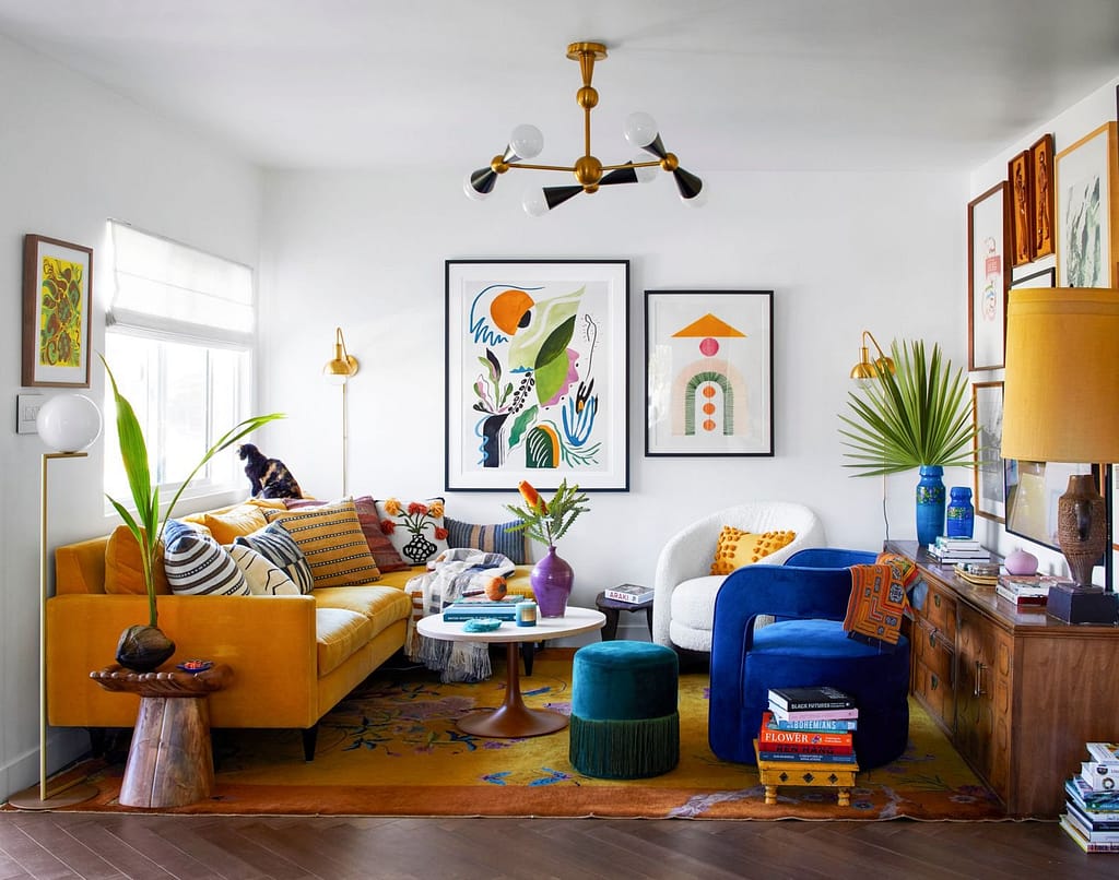
Sunlit Coral, a bold and refreshing hue, captures the radiant energy of the summer sun. This color is perfect for creating a warm and inviting atmosphere, making it a favorite choice for living rooms and bedrooms. Its ability to infuse a space with energy while maintaining a cozy feel makes it a versatile option for various design styles.
- Why It Works: Sunlit Coral’s warm undertones are reminiscent of a sunrise, adding a sense of optimism and warmth to your home. It pairs well with neutrals, helping to balance its intensity while keeping the space light and airy.
- How to Use It: Use Sunlit Coral as an accent color through decorative elements like throw pillows, artwork, or a statement piece of furniture. For a bold approach, consider an accent wall in this vibrant hue, complementing it with muted tones such as beige, soft gray, or even pastel blues.
- Designer Insight: “Sunlit Coral is perfect for creating an inviting space that feels alive and full of character. It works beautifully with natural textures like rattan and jute, enhancing its summery appeal.” – Emma Brooks, Interior Designer
2. Oceanic Teal: A Breath of Fresh Air

Oceanic Teal is a refreshing shade that evokes the tranquility of the sea, making it ideal for creating a calming atmosphere in your home. This versatile color is suitable for any room and can seamlessly transition between seasons, offering a timeless appeal.
- Why It Works: Oceanic Teal’s soothing qualities make it perfect for spaces designed for relaxation and reflection, such as bedrooms and bathrooms. Its versatility allows it to pair beautifully with a range of colors, from sandy beige to crisp white.
- How to Use It: Consider painting an accent wall in Oceanic Teal or incorporating it through textiles like curtains, rugs, and cushions. For a cohesive look, add decor elements like ceramic vases or glassware in similar shades.
- Designer Insight: “Oceanic Teal brings the calming essence of the ocean into your home. It’s a wonderful color to use in spaces where you want to unwind and recharge.” – Lucas Nguyen, Interior Designer
3. Citrus Burst: A Splash of Energy

Citrus Burst is a lively and energetic yellow-orange shade that instantly uplifts the mood of any space. This color is perfect for areas where creativity and conversation thrive, such as kitchens and dining rooms.
- Why It Works: The zesty nature of Citrus Burst stimulates creativity and adds a playful touch to your decor. Its ability to energize a space makes it a fantastic choice for social areas where you want to encourage interaction.
- How to Use It: Integrate Citrus Burst through accent pieces like dining chairs, tableware, or even a feature wall. Pair it with natural wood elements and greenery to create a vibrant, nature-inspired aesthetic.
- Designer Insight: “Citrus Burst is a dynamic color that brings joy and vitality to any space. It’s especially effective in kitchens, where it can inspire culinary creativity.” – Amelia Tran, Interior Designer
4. Lush Meadow Green: A Touch of Nature

Lush Meadow Green embodies the beauty of a summer garden, bringing a rich and earthy feel to your home. This color adds depth and sophistication, making it a popular choice for creating a seamless connection between indoor and outdoor spaces.
- Why It Works: Lush Meadow Green’s deep, natural tones are grounding, offering a sense of stability and harmony. It’s a color that resonates with both traditional and contemporary designs, providing a timeless quality to your decor.
- How to Use It: Incorporate Lush Meadow Green through indoor plants, accent walls, or furniture upholstery. This color works well in spaces where you want to establish a connection to nature, such as living rooms and home offices.
- Designer Insight: “Lush Meadow Green is perfect for those who want to bring the outdoors in. It adds a sense of vitality and connection to nature that enhances any living space.” – Olivia Chen, Interior Designer
5. Serene Lavender: A Soft Touch

Serene Lavender is a gentle, pastel hue that adds a touch of elegance and calmness to any room. Its soothing properties make it ideal for spaces dedicated to relaxation, such as bedrooms and bathrooms.
- Why It Works: Serene Lavender’s soft tones are calming and serene, creating an atmosphere of tranquility. It’s a color that pairs beautifully with neutrals and metallics, adding a sophisticated touch to your decor.
- How to Use It: Use Serene Lavender in bedding, wall paint, or decorative accessories like vases and candles. For a chic look, pair it with white and silver accents, enhancing its calming effect.
- Designer Insight: “Serene Lavender is the epitome of elegance and tranquility. It’s a versatile color that can transform any space into a serene retreat.” – Sophia Kim, Interior Designer
By incorporating these five trending colors into your home decor, you can capture the vibrant energy of summer and create a space that feels fresh and inviting. Whether you’re looking to make a bold statement or add subtle touches of color, these hues offer endless possibilities for transforming your home into a summery sanctuary. Let me know if you would like to make any adjustments or add more information!